8.1.6 Network
The Network Dashboard uses vCenter Operations Manager data collected from vCenter and from Hyperic. The Hyperic server uses SNMP to collect data from a Cisco 3550 switch.
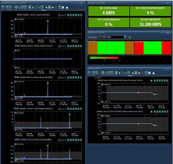
The completed network dashboard widget is displayed in Figure 62, and is made from four widgets:
 Outbound/Inbound Packet Rate
 Metric Graph (
Figure 63).
Network Performance
Metric Graph (Figure 66).
Figure 62. Network Dashboard Widget
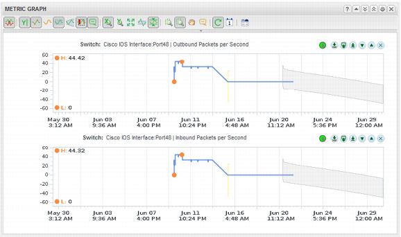
This example monitors port 48 on the switch for outbound and inbound packets. The metric graph displays these two metrics.
Metric | Unit |
Cisco IOS Interface:Port48 | Outbound packets per second |
Cisco IOS Interface:Port48 | Inbound packets per second |
The c
ompleted w
idget appears as shown in Figure 63.
Figure 63. Outbound and Inbound Packet Rate Metric Graph
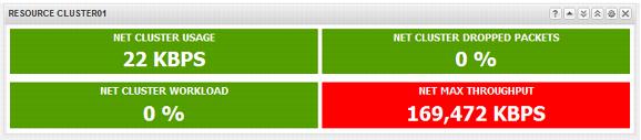
Using the Scoreboard Widget and some cluster wide statistics, the following widget can be created to show statistics on inbound packets per second network bandwidth usage and errors. This widget uses the following metrics:
Metric | Unit | Green Range | Yellow Range | Orange Range | Red Range |
Net Cluster Usage | KBps | 100 | 100–1000 | 1000–5000 | 5000 |
Net Cluster Demand | % | 50 | 50–60 | 60–70 | 70 |
Net Cluster Workload | % | 50 | 50–60 | 60–70 | 70 |
Net Max Throughput | Kbps | 6000 | 6000–6500 | 6500–7000 | 7000 |
Note: These threshold/ranges are only examples. These values should be based on the cluster design threshold values and the customer requirements.
The completed widget appears
as shown in Figure 64.
Figure 64. Completed Network Scoreboard Widget
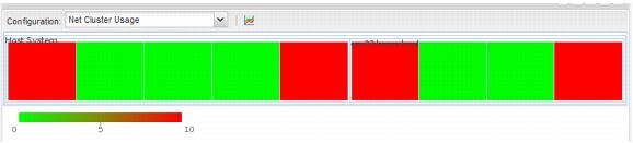
A Heat Map widget can be used to display statistics for physical NIC usage in the ESXi host. The heat map settings for this widget are as shown in the following table.
Metric | Value |
Refresh Widget Content | On |
Widget Refresh Interval | 300 |
Group by | Resource kind |
Mode | Instance |
Resource Kinds | Host systems |
Attribute Kinds | Network | usage rate (KBps) |
Tags to filter | Cluster compute resource | cluster |
The completed heat map widget appears as shown in Figure 65.
Figure 65. Physical NIC Heat Map Widget
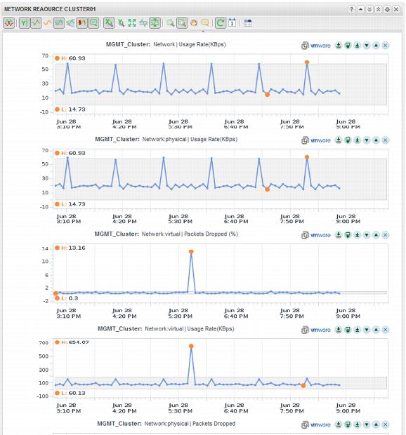
The Metric Graph widget can display historical network details regarding usage and errors. The Widget displays information on both the physical and virtual networking. The widget is configured with the following metrics:
Metric | Units |
Network | Usage Rate (KBps) |
Network:Physical | Packets Dropped |
Network:Physical | Usage Rate (KBps) |
Network:Virtual | Packets Dropped (%) |
Network:Virtual | Usage Rate (KBps) |
The Completed widget appears
as shown in Figure 66.
Figure 66. Network Performance Metric Graph Widget