8.1.5 vCenter Operations Manager Dashboards
To get the full value from vCenter Operations Manager to monitor a vCloud environment, it is recommended that you configure vCenter Operations Manager dashboards. These dashboards provide a view of the health of the various vCloud constructs.
Dashboards can be shared between Admin groups. Examples of this are the disk and network dashboards. The storage administrators can have a dashboard that is related only to storage metrics from the cluster. This dashboard can include metrics such as cluster disk I/Os or read/write latency. At the same time, the network administrators can have a dashboard that is related to the cluster networking metric. These metrics can include physical switches that are connected to the vSphere cluster to give the network administrator visibility into statistics from the virtual and physical environment on one dashboard.
For this example, a dashboard has been created to display the following statistics on the resource cluster:
 Capacity
 remaining.
Alerts and events.
Network.
Storage.
Memory.
CPU.
A second dashboard gives statistics on the management cluster. The dashboard has been configured with the following metrics:
vCenter SQL database transactions/database size.
vCloud Director SQL database transactions/database size.
SQL Server operating system
drive space remaining.
vCenter Server operating system
drive space remaining.
vCloud Director mount point space remaining.
8.1.5.1. vCenter Operations Manager Widget Configuration
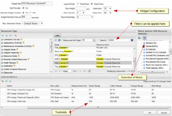
The custom UI of vCenter Operations Manager uses widgets to display information about objects that are being monitored. Some widgets display only data, but others can be configured to display data and set thresholds that display different colors when thresholds are exceeded. The following are two examples of how to configure widgets.
8.1.5.2. Generic Scoreboard
The widget configuration settings are shown in the following table.
Setting | Value |
Widget Title | Displayed title of widget |
Self Provider | On |
Refresh Widget Content | On |
Widget Refresh Interval | 300 (seconds) |
After the widget settings have been set, the relevant objects and metrics must be selected. This example uses a filter for cluster. Then, the cluster for which we want to display statistics and metrics is selected. After all of the desired metrics are listed in Selected Metrics, the thresholds can be configured.
The following table shows the thresholds that can be set.
Threshold | Range |
Green | Up to 10 |
Yellow | 10–20 |
Orange | 20–30 |
Red | 30 and higher |
The following figure shows the completed widget.
Figure 41. Generic Cluster CPU Scoreboard
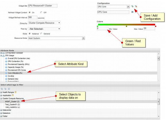
8.1.5.3. Heat Map
The Heat Map widget can be used when a few objects (for example, datastores, cluster physical CPU cores) must be displayed in comparison with each other. For example, physical CPU cores can be displayed for all hosts in a cluster, and those over a certain threshold can be displayed as red to indicate hot spots.
The widget configuration settings are shown in the following table.
Setting | Value |
Widget Title | Displayed title of widget |
Self Provider | On |
Refresh Widget Content | On |
Widget Refresh Interval | 300 (data collection is every 300 seconds) |
Group By | Select object to group by |
Resource Kind | Heat map data displayed for which type of resource |
After the resource kind has been selected, choose the reported metric by selecting the attribute kind. Then select the tag from which the data will be reported.
After the selection of metric and tags, save the configuration. Click the green plus sign to give the configuration a name and save it. Multiple configurations can be saved and then selected to be displayed on the same widget.
The completed heat map widget is shown in the following figure.
Figure 42. Management Cluster CPU Core Utilization Heat Map
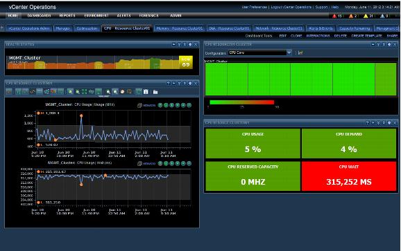
8.1.5.4. Physical CPU Resource Monitoring of Resource Clusters
The CPU Dashboard can be used to monitor the physical CPU performance of the resource cluster
. Figure 43 shows a sample dashboard that was built using the following
widgets.
Figure 43. CPU Resource Cluster Dashboard
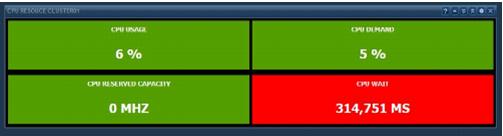
The Generic Scoreboard
widget is at
the bottom r
ight of the d
ashboard in Figure 43.
The selection is based on the resource cluster metric which
is a sum of all h
ost metrics in the c
luster. Table 17. Generic Scoreboard Widget Configuration
Metric | Unit | Green Range | Yellow Range | Orange Range | Red Range |
Capacity Usage % | % | 50 | 50–75 | 75–85 | 85 |
Demand | % | 50 | 50–75 | 75085 | 85 |
CPU Reserved Capacity | MHz | 100000 | 100000–150000 | 150000–175000 | 175000 |
Wait | ms | 100 | 100–200 | 200–300 | 300 |
NoteThese threshold/ranges are only examples. These values should be based on the cluster design threshold values and the customer requirements.
Figure 44. Resource Cluster CPU Scoreboard Widget
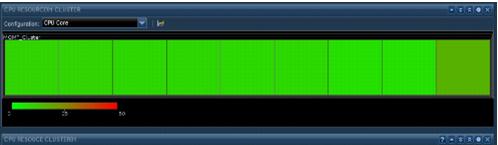
The Heat Map widget shows the resource cluster physical CPU core utilization. This displays all the ESXi physical CPUs and cores in the resource cluster to identify hot spots on the physical CPUs. This configuration uses the core utilization metric and resource cluster tag to display the heat map data.
Figure 45. Resource Cluster Physical CPU Core Heat Map Widget
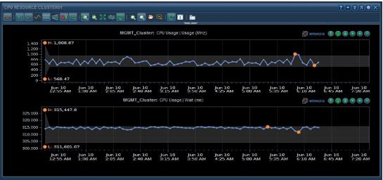
The Metric Graph widget is used to give a graph view of some of the CPU metrics. The view is customizable to display from last hour to last year. The graph can also display the dynamic thresholds for certain metrics. As an example, this widget displays the cluster CPU usage and cluster CPU wait.
Figure 46. Resource Cluster CPU Metric Graph Widget
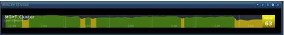
The Health widget is used to display overall Resource Cluster Health. The widget can be configured to display data from the last hour to last month.
Figure 47. Cluster Health Widget
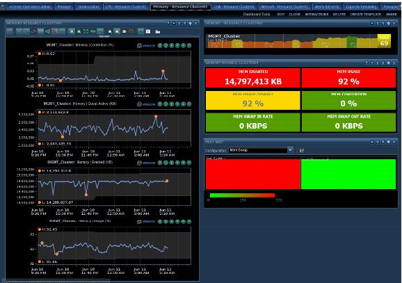
8.1.5.5. Memory Dashboard
The Memory Dashboard can be used to monitor the cluster memory usage and demand. Figure 48 shows a sample dashboard that was built
using the following widgets.
Figure 48. Cluster Memory Dashboard
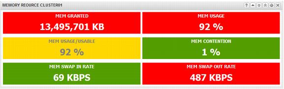
The Generic Scoreboard widget was configured with these metrics defined at the cluster level. The resource cluster is used for the memory metric selections.
Table 18. Generic Scoreboard Configuration
Metric | Unit | Green Range | Yellow Range | Orange Range | Red Range |
Memory Granted | KB | 8000 | 8000–12000 | 12000–13000 | 13000 |
Usage | % | 50 | 50–75 | 75–80 | 80 |
Usage/Usable | % | 50 | 50–75 | 75–80 | 80 |
Contention | % | 50 | 50–75 | 75–80 | 80 |
Swap In Rate | KBps | 300 | 300–400 | 400–500 | 500 |
Swap Out Rate | KBps | 5 | 5–10 | 10–20 | 20 |
NoteThese threshold/ranges are only examples. These values should be based on the cluster design threshold values and the customer requirements.
Figure 49. Cluster Memory Scoreboard Widget
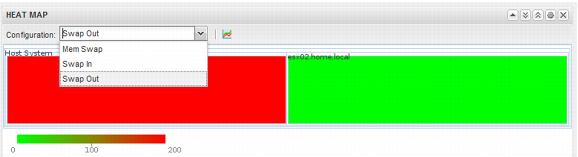
The Heat Map is configured with three metrics, created from the cluster resource, as follows:
Swap Out Rate (KBps).
Swap In Rate (KBps).
Mem Swap Used (Kb).
The following are settings for the Heat Map widget.
Table 19. Settings for the Heat Map Widget
Metric | Value |
Attribute Kinds | Memory |
Tags to Filter | Cluster compute resource (select the correct cluster) |
Minimum Value | (Custom setting to environment) |
Maximum Value | (Custom setting to environment) |
Figure 50. Cluster Memory Heat Map Widget
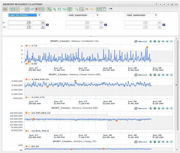
The Metric Graph Widget can display line graphs of historical memory statistics. This example selects the following memory metrics to be displayed over a 24-hour period. Note that the historical time can be changed to up to one year and can also indicate the DT (dynamic threshold) values.
Table 20. Cluster Memory Metric Graph Settings
Metric |
Memory | Contention (%) |
Memory | Guest Active (KB) |
Memory | Granted (KB) |
Memory | Usage (%) |
Figure 51. Cluster Memory Metric Graph Widget
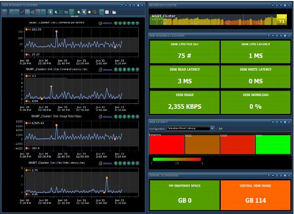
8.1.5.6. Storage Dashboard
The Storage
Dashboard widget
can help with
troubleshooting at the cluster or host level
and can be used by the virtual infrastructure admins and the storage administrators. Figure 52 shows this dashboard,
which is built using four widgets:
Cluster Storage Metric Graph (
Figure 55).
This dashboard focuses on cluster statistics and datastore hot spots. Hot spots in this example are related to latency to the datastore as detected by the ESXi host. Heat maps can also be used to identify datastores with low capacity remaining, which is done using a super metric.
Figure 52. Storage Dashboard
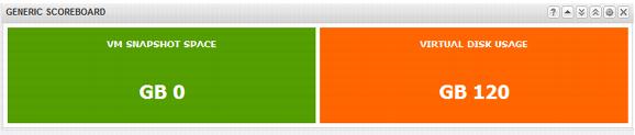
This dashboard uses two Scoreboard widgets. The first widget displays statistics related to the cluster I/O usage. The second widget displays information about virtual memory snapshot space and virtual disk usage.
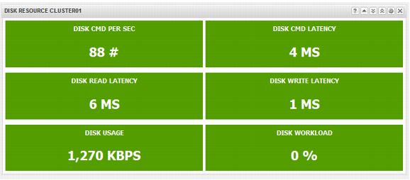
Table 21. Cluster Storage Usage Widget Settings
Metric | Unit | Green Range | Yellow Range | Orange Range | Red Range |
Disk CMD Per Sec | # | 200 | 200–300 | 300–400 | 400 |
Disk CMD Latency | ms | 20 | 20–30 | 30–40 | 40 |
Disk Read Latency | ms | 20 | 20–30 | 30–40 | 40 |
Disk Write Latency | ms | 20 | 20–30 | 30–40 | 40 |
Disk Usage | KBps | 10000 | 1000–2000 | 2000–3000 | 3000 |
Disk Workload | % | 50 | 50–60 | 60–70 | 70 |
NoteThese threshold/ranges are only examples. These values should be based on the cluster design threshold values and the customer requirements.
Figure 53. Cluster Disk Scoreboard Widget
The second generic scoreboard widget displays virtual machine disk space information. This example shows how much snapshot space is used and the total amount of virtual disk space used.
Table 22. Cluster Disk Capacity Scoreboard Settings
Metric | Unit | Green Range | Yellow Range | Orange Range | Red Range |
Virtual Machine Snapshot Space | GB | 1 | 1–10 | 10–20 | 20 |
Virtual Disk Usage | GB | 90 | 90–200 | 200–500 | 500 |
NoteThese threshold/ranges are only examples. These values should be based on the cluster design threshold values and the customer requirements.
Figure 54. Cluster Disk Capacity Scoreboard Widget
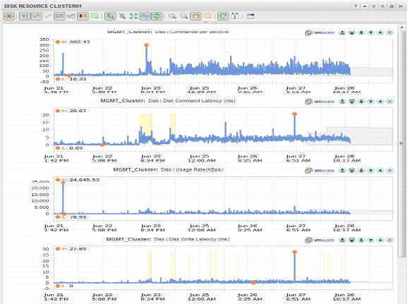
T
he Metric Graph widget displays
historical disk statistic
s that include the DT values. The DT values are also displayed for the next number of
hours, depending
on the Date Control selection). Figure 55 shows the Anomalies view enabled
(all of the yellow spikes). For the example we are displaying historical stats for the following metrics.
Table 23. Example Metrics
Metric | Unit |
Disk | Commands per second |
Disk | Disk commands latency (ms) |
Disk | Usage rate (KBps) |
Disk | Disk write latency (ms) |
Disk | I/O usage capacity |
Figure 55. Cluster Storage Metric Graph Widget