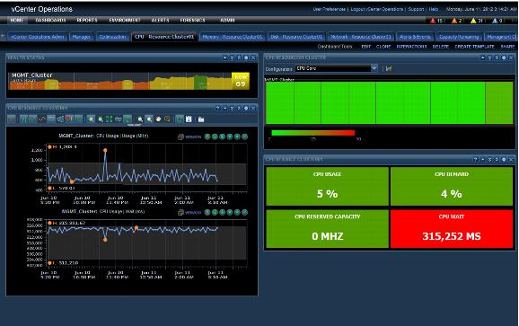
8.1.5.4. Physical CPU Resource Monitoring of Resource Clusters
The CPU Dashboard can be used to monitor the physical CPU performance of the resource cluster
. Figure 49 shows a sample dashboard that has been created using four widgets
, which are illustrated in Figure 50, Figure 51, Figure 52, and Figure 53. These widgets include: Figure 49. CPU Resource Cluster Dashboard
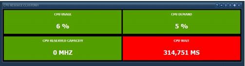
The Generic Scoreboard
widget is at
the bottom r
ight of the d
ashboard in Figure 49.
The selection is based on the resource cluster metric which
is a sum of all h
ost metrics in the c
luster. Table 17. Generic Scoreboard Widget Configuration
Metric | Unit | Green Range | Yellow Range | Orange Range | Red Range |
Capacity Usage % | % | 50 | 50–75 | 75–85 | 85 |
Demand | % | 50 | 50–75 | 75085 | 85 |
CPU Reserved Capacity | MHz | 100000 | 100000–150000 | 150000–175000 | 175000 |
Wait | ms | 100 | 100–200 | 200–300 | 300 |
These threshold/ranges are only examples. These values should be based on the cluster design threshold values and the customer requirements.
Figure 50. Resource Cluster CPU Scoreboard Widget
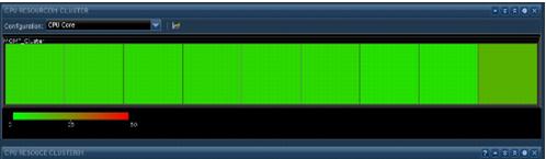
The Heat Map widget shows the resource cluster physical CPU core utilization. This displays all the ESXi physical CPUs and cores in the resource cluster to identify hot spots on the physical CPUs. This configuration uses the core utilization metric and resource cluster tag to display the heat map data.
Figure 51. Resource Cluster Physical CPU Core Heat Map Widget
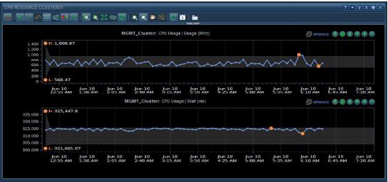
The Metric Graph widget is used to give a graph view of some of the CPU metrics. The view is customizable to display from last hour to last year. The graph can also display the dynamic thresholds for certain metrics. As an example, this widget displays the cluster CPU usage and cluster CPU wait.
Figure 52. Resource Cluster CPU Metric Graph Widget
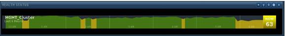
The Health widget is used to display overall Resource Cluster Health. The widget can be configured to display data from the last hour to last month.
Figure 53. Cluster Health Widget