8.1.5.3. Heat Map
The Heat Map widget can be used when a few objects (for example, datastores, cluster physical CPU cores) must be displayed in comparison with each other. As an example, physical CPU cores can be displayed for all hosts in a cluster, and those over a certain threshold are displayed as red to identify hot spots.
The widget configuration settings are shown in the following table.
Setting | Value |
Widget Title | Displayed title of widget |
Self Provider | On |
Refresh Widget Content | On |
Widget Refresh Interval | 300 (data collection is every 300 seconds) |
Group By | Select object to group by |
Resource Kind | Heat map data displayed for which type of resource |
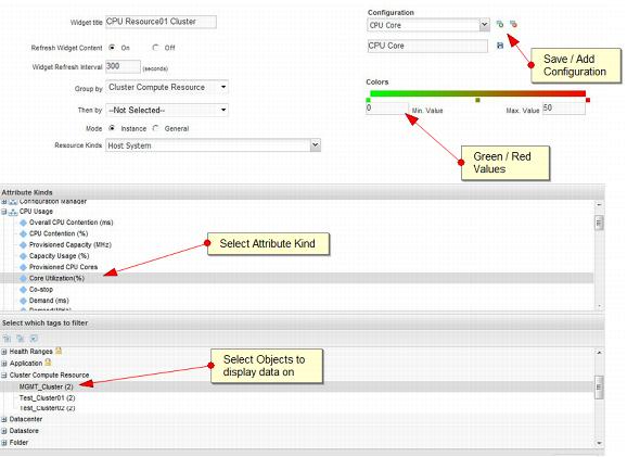
After the resource kind has been selected, choose the reported metric by selecting the attribute kind. Then select the tag from which the data will be reported.
After the selection of metric and tags, the configuration must be saved. Click the green plus sign to give the configuration a name and save it. Multiple configurations can be saved and then selected to be displayed on the same widget.
The completed heat map widget is shown in the following figure.
Figure 48. Management Cluster CPU Core Utilization Heat Map